Tuesday, March 23, 2010
NEW LOGO WITH 2010 (REV.03-23-2010)
NEW GRAPHICS FILES (WITH THE "2010" PART IN THE LOGO)
I have added the "2010" part to the logo. Please discard any old logos and use the new ones found in the graphics folder here:
http://daishow.sfsu.edu/graphics_files/in_pulse_2010/
I have added the "2010" part to the logo. Please discard any old logos and use the new ones found in the graphics folder here:
http://daishow.sfsu.edu/graphics_files/in_pulse_2010/
Sunday, March 21, 2010
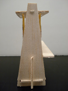
Current Model
Thursday, March 18, 2010
Submissions Poster
 This will be revised shortly to follow Alfred's grid, and later on with the proper san-serif font (since the version I have isn't windows-friendly). It's also really strong, because of the b&w and the very visible grid. I'm going to try to soften it or pull it back a little, either with a background or knocking out more cells (possibly replacing them with some of the photos Mary uploaded).
-Jenny
Poster
Wednesday, March 17, 2010
Hey guys, I was messing around with line patterns in class yesterday for postcards and posters (posters on next post), but came up with a nice visual that really shows rhythm. Thought it was interesting...maybe too much line usage, or maybe the idea could be pushed more? Feedback would be cool, or we could chat in class. I heard Pino saying the front of the postcard needed to have more to it than just the logo, so I actually did the posters first then applied it to the postcard. Just an idea.


Tuesday, March 16, 2010
Postcard updated
structures idea
Monday, March 15, 2010
IN P U L S E Postcard


This is a postcard layout idea for the show. I used imagery of a jelly fish to represent the motion of "pulsating". I then layered the same image to create a blur effect.
I know we were specifically advised to not alter the colors on the gradient bar of the logo but on the front cover I knocked it out all together because it looked cleaner than using the color or b&w logo. I also masked the imagery in the back logo so the postcard would tie together. If this is a problem I can swap in the color logo.
Sunday, March 14, 2010
West Office
I wasn't able to make it for this field trip, however, based on the West Office website it seems to me there are drastic differences between Mauk's firm and West Office's. The first thing I noticed are the clients West Office has worked for. There is a trend of permanence with the types of exhibits they work on, such as the Discovery Museum at the World Forestry Center and the Saudi Aramco Exhibit Center. Many of the exhibits also tend to have the element of interactivity, especially with children.
The virtual tour of the the office space shows ample workspace, a lovely wall library, lots of desks, plenty of natural light, and a mystery upstairs area (the virtual tour doesn't cover the upper level).
Friday, March 12, 2010
structures idea
Thursday, March 11, 2010
Mauk Design

Mauk Design!
The trip to Mauk Design was very inspiring for me. Seeing how professional and organized the company was incredible. I loved the most how it was a small group, and they were able to work on their own and in a quiet environment. I was inspired the most by their little workshop in the back. They had all the tools they needed in a tiny room, and it seemed very peaceful.
I was however dissapointed in the presentation. I was looking forward to seeing more of their deisgns and projects they did over the years. If they did indeed do about six projects every 6 months, then they should have showed us much more stuff. Oh wells. Maybe next time!
IN PULSE POST CARD
Wednesday, March 10, 2010
mauk design

The trip to Mauk design was very interesting and informal. I know nothing about exhibit design so seeing their different projects for companies like McDonalds and playstation I found it to be very inspirational. I love the saying that Mitchell told the class that great designers can design anything for me that is something that us designers should look to in our designs. I also found that one of their smaller project was my favorite and that was the design for adobe. It was just a window fixture but for me I understood what they were going for and I thought it was really smart to use the colors from the color guide to me that represented Adobe.
Subscribe to:
Comments (Atom)


