

In Pulse Exhibition:
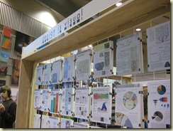
I did not really have a chance to enjoy the exhibition except taking pictures due to the final projects and exams. Overall I think the exhibition looks really simple, clean, and professional. It would have been better if we could get more submissions to fill up all the empty spaces. The name cards were a little disorganized.
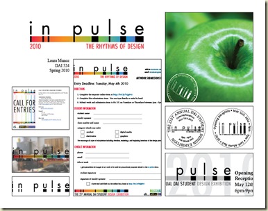
Concept behind the "in pulse" logo:
- The lowercase letterform and the spacing create the wave-like rhythms
- The color spectrum enhances the meaning of the pulsation as well as the rhythms of design. Different colors are formed because of different wavelengths, and different wavelengths have different rhythms (A graphic design/world without colors is dull, and colors do not belong to anyone)
- The black bars also emphasize the beat-like rhythms
- The word "pulse" itself has the meaning of beats/waves/rhythms
- Projects/deadlines should be assigned/informed asap
- Call for Entry poster should be done and posted asap to get more submissions
- Timely feedback is very, very, very important
- Students with improper behavior should be warned and removed from class as it stated in the syllabus. (We are not high school kids anymore people)
- Strict deadlines with submissions should be applied to everyone. I knew students in our class sneaked their projects in the show without following the proper rules
- Product students should not be allowed to set up the display. If they do not trust our students on handling their products, they should not submit their work to the show
I would like to say, "thank you to those who have created such a special learning environment/experience for me. I became a stronger person today because of you. If I have many obstacles that I need to go through in my life time, I am glad that I already overcame one."
Special Thanks:
Special thanks to Prof. Trogu. I could not have completed my timeline project without your patience, help and support, and thank you for the yummy Focaccia. :)


